Redesign of the logistic service application

The concept is the redesign of the Ukrainian logistic service application. Nova Poshta is a postal and courier company that provides express shipping of documents, freight, and parcels for individuals and businesses.


Home screen redesign
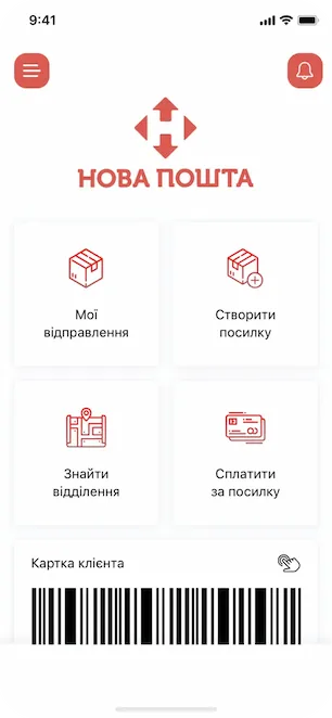
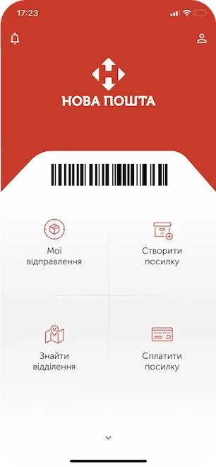
I like the idea of the 4 squares on the home-hero screen because it looks simple and clear. Nevertheless, we reorganized the home-hero screen a little bit. We succeeded in improving the accessibility by placing the client's card at the bottom, so the thumb of the right hand can tap it much faster and easier. We also eliminated a large red space and made accents on the important UI elements only.


User’s account
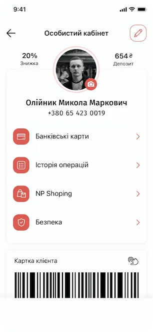
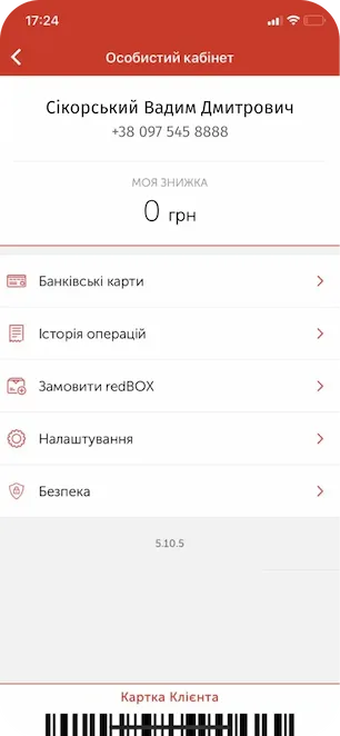
We simplified the personal account screen and added an "Edit" function to change an email or other personal data when needed. Also, we added bonus data and deposit data as now the Nova Poshta has its own payment system. The goal was to create a user-friendly design by reorganizing and optimizing the screen place.


Find shippinng branch
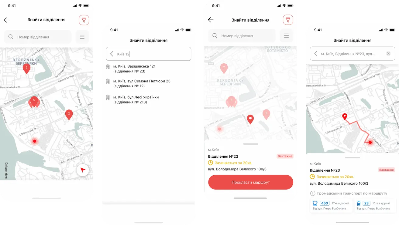
“To be user-friendly” means to be friendly to the users on each screen, understanding their needs and goals. We designed a map section to help users find the nearest department of the Nova Poshta, pave the fastest route, and get or send the parcel.

Payment screen upgrade
Sure, we redesigned the payment screen, and now it is possible to pay for the services using the application to improve the User experience, so you don't need to pay at the department. We placed a shipment that needs to be paid at the top of the screen, so it's very easy to notice it. It's always good when such information is located in a prominent place.
